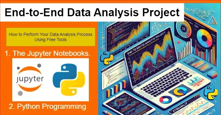
Are you looking for a data analysis dashboard analysis to inspire and guide you in your data science project? Look no further because you have come to the right place. Here is a guide detailing how to come up with an End-to-End Data Analysis project using Python from scratch. The best part is that it contains screenshots showing the source codes.
This project is an excellent step-by-step tutorial to help you accomplish your data science course project goals. Therefore, its originality and uniqueness will greatly inspire you to innovate your own projects and solutions.
Project Title:
The Ultimate Career Decision-Making Guide: – Data Jobs
Tagline:
Navigating the Data-Driven Career Landscape: A Deep Dive into AI, Machine Learning, and Data Science Salaries.
1. Introduction
Right now, the technology landscape is rapidly evolving. Since the landscape of technology is ever-evolving, the allure of Artificial Intelligence (AI), Machine Learning (ML), and Data Science has captivated the ambitions of different people. For example, fresh graduates and college students. Additionally, professionals seeking career transitions or skill advancements like me. Furthermore, those who are unemployed or underemployed are also captivated by these fields.
However, stepping into these domains has its challenges. Aspiring individuals like you and me often confront uncertainties surrounding market demands, skill prerequisites, and the intricacies of navigating a competitive job market.
Thus, in 2023, I found myself in a data science and machine learning course as I tried to find my way into the industry.
1.1. Scenario Summary for the Data Analysis with Python Project.
Generally, at the end of any learning program or course, a learner has to demonstrate that they meet all the criteria for successful completion. This can be by way of a test or project deliverables. The final test is for the purpose of certifications, graduation, and subsequent release to the job market.
As a result, a test, exam, or project deliverable is administered to the student. Then, after certification, one is released to practice the skills acquired in real-life scenarios or situations such as company employment or startups.
Applying the above concept to myself, I had to be certified at the end of my three-month intermediary-level course in 2023. The course is on Data Science and Machine Learning using the Python Programming Language. It is offered by the Africa Data School (ADS) in Kenya and other African countries.
At the end of the ADS course, the learner has to work on a project that meets the certification and graduation criteria. Therefore, from the college guidelines, it goes without saying that for me to graduate, I had to work on either;
- An end-to-end data analysis project, OR,
- An end-to-end machine learning project.
The final project product was to be presented as a Web App deployed using the Streamlit library in Python. To achieve optimum project results, I performed it in two phases:
- The data analysis phase, and
- The Web App design and deployment phase.
1.2. Project Background: What Inspired My End-to-End Data Analysis Project.
In mid 2023, I found myself at a crossroads in my career path. As a result, I did not have a stable income or job. For over 7 years, I have been a hybrid freelancer focusing on communication and information technology gigs.
As a man, when you cannot meet your financial needs, your mental and psychological well-being is affected. Thus, things were going well for me socially, economically, and financially. For a moment, I considered looking for a job to diversify my income to cater to my nuclear family.
Since I mainly work online and as I look for new local gigs, I started looking for ways to diversify my knowledge, transition into a new career, and subsequently increase my income. From my online writing gigs and experience, I observed a specific trend over time and identified a gap in the data analysis field.
1.2.1. What was the identified gap in data analysis field?
I realized that data analysis gigs and tasks that required programming knowledge were highly paid. However, only a few people bid on them on different online job platforms.
Therefore, the big question was why data analysis jobs, especially those requiring a programming language, overstayed on the platforms with few bids. Examples of the programming languages I spotted an opportunity in most of those data analysis jobs include Python, R, SQL, Scala, MATLAB, and JavaScript. The list is not exhaustive – more languages can be found online.
Do you want to learn more what is a programming language before you continue with this project guide? You can read it and some more examples here.
1.2.1.1. What I realized in further analysis of the market gap.
As a result of the phenomenon, I started doing some research. In conclusion, I realized that many freelancers, I included, lacked various programming skills for data analysis. To venture into a new field and take advantage of the gap required me to learn and gain new skills.
However, I needed guidance to take advantage of the market gap and transition into the new data analysis field with one of the programming languages. I did not readily find one, so I decided to take a course to gain all the basic and necessary skills and learn the rest later.
1.2.1.2. What led to the birth of the end-to-end data analysis project?
Following strong intuition coupled with online research about data science, I landed at ADS for a course in Data Science and Machine Learning (ML) using Python. It is an instructor-led intermediary course with all the necessary learning resources and support provided.
Finally, at the end of my course, I decided to come up with a project that would help people like me to make the right decisions. It is a hybrid project that uses end-to-end data analysis skills and machine learning techniques. Combining both concepts is to keep it current with financial market rates.
1.2.1.3. How to Create the Project in simple phases.
I worked on it in two simple and straightforward steps and phases. Thus, in this detailed tutorial, I intend to take you through them. They include:
- Phase 1: End-to-End Data Analysis. Dataset Acquisition, Analysis, and Visualization using Python, the Jupyter Notebook and Anaconda.
- Phase 2: Web App Design and Deployment. Converting the Phase 1 information and insights into a Web App using the Streamlit library.
Next, let me take you through the first phase. In any project, it is important to start by understanding its overall objective. By comprehending the goal of the project, you can determine if it fits your needs. It is not helpful to spend time reading through a project only to realize that it is not what you wanted.
Therefore, we will start with the phase objective. Then, we shall move on to the other sections of the project phase.
1.3. Project Objective for the End-to-End Data Analysis Phase.
The end-to-end data analysis project analyzes and visualizes a dataset encompassing global salaries in the AI, ML, and Data Science domains. The aim is to provide you with helpful data-driven insights to make the right career decisions. Thus, it delves into critical variables of the dataset, including the following.
- working years,
- experience levels,
- employment types,
- company sizes,
- employee residence,
- company locations,
- remote work ratios, and
- salary in USD and KES.
Thus, the final results were useful data visualizations for developing a web application. You will learn what is a web application in the next phase – project’s phase 2 tutorial.
The End-to-End Data Analysis Process.
The first phase was the data analysis stage. Here I searched and obtained a suitable dataset online.
Step 1: Explorative Data Analysis (EDA) Process
What is Explorative Data Analysis (EDA)? In simple terms, EDA is the foundation upon which we build every data science project is. Thus, it serves as the critical first step.
That is why it is the first part of my project. EDA allows data scientists to deeply investigate their dataset, uncover valuable insights, and shape the course of the subsequent analysis. As you proceed reading this project guide, you will see how applied it in section one.
At its core, EDA is all about understanding the nuances of your data—its structure, hidden patterns, irregularities, and underlying relationships. For example, I looked at missing values, data types, and basic data frame structure before analysis.
This thorough exploration provides the necessary clarity to make informed decisions throughout the machine learning pipeline, guiding data preprocessing, model selection, and the interpretation of results. Explorative Data Analysis consists of three essential components:
1.0.1. Dataset Overview and Descriptive Statistics.
This step involves getting a broad understanding of the dataset, including basic statistical metrics such as mean, median, and variance. It helps in identifying missing values and distribution patterns.
1.0.2. Feature Assessment and Visualization.
Here, individual features are analyzed for relevance and impact. Various visualization techniques like histograms, scatter plots, and correlation matrices allow researchers to detect trends and relationships.
1.0.3. Data Quality Evaluation.
Ensuring data integrity is crucial. This step focuses on spotting inconsistencies, missing values, and outliers that could skew analysis, ultimately leading to better model performance.
By prioritizing a comprehensive EDA process, data scientists equip themselves with the insights needed to refine their approach, optimize models, and extract the maximum value from their data. Next, let us go through our actual project’s EDA process.
1.1. Dataset Choice, Collection, Description, and Loading.
The project’s data is obtained from the ai-jobs.net platform. For this project, the link used to load the data explored is for the CSV file on the platform’s landing page.
Nonetheless, the dataset can also be accessed through Kuggle. Since the data is updated weekly, the link will facilitate continuous weekly data fetching for analysis in order to keep the Ultimate Data Jobs and Salaries Guider Application updated with the current global payment trends.
Dataset Source = https://ai-jobs.net/salaries/download/salaries.csv
1.2. Raw Dataset Description
The dataset contained 11 columns with the following characteristics:
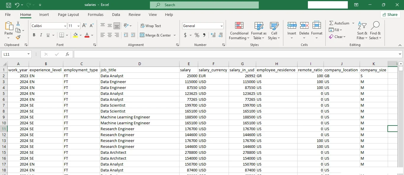
- work_year: The year the salary was paid.
- experience_level: The experience level in the job during the year.
- employment_type: The type of employment for the role.
- job_title: The role worked during the year.
- salary: The total gross salary amount paid.
- salary_currency: The currency of the salary paid is an ISO 4217 currency code.
- salary_in_usd: The salary in USD (FX rate divided by the average USD rate for the respective year via data from fxdata.foorilla.com).
- employee_residence: Employee’s primary country of residence as an ISO 3166 country code during the work year.
- remote_ratio: The overall amount of work done remotely.
- company_location: The country of the employer’s main office or contracting branch as an ISO 3166 country code.
- company_size: The average number of people that worked for the company during the year.
1.3. Data Loading
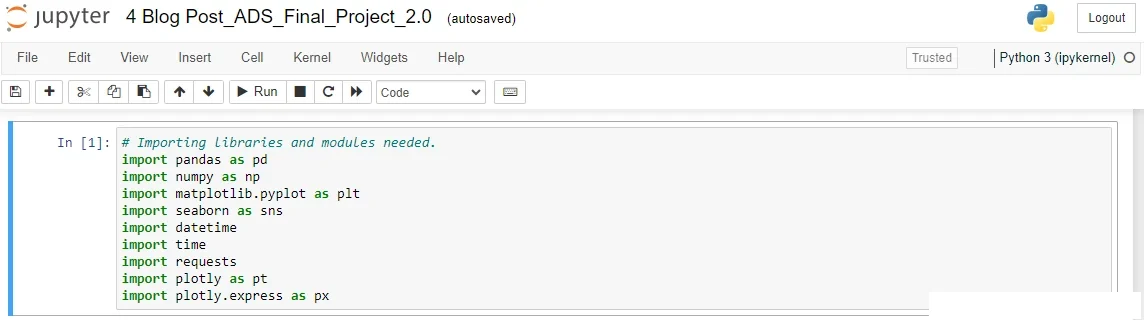
First, I imported all the necessary libraries and modules to load, manipulate, and visualize the Data in Cell 1 of the Jupyter Notebooks.
Then, I loaded the data from the URL source using Pandas in Cell 2. Similarly, the Pandas “. head ()” function was used to display the first five rows in the dataset. See the Jupyter Notebooks cell snippet below.
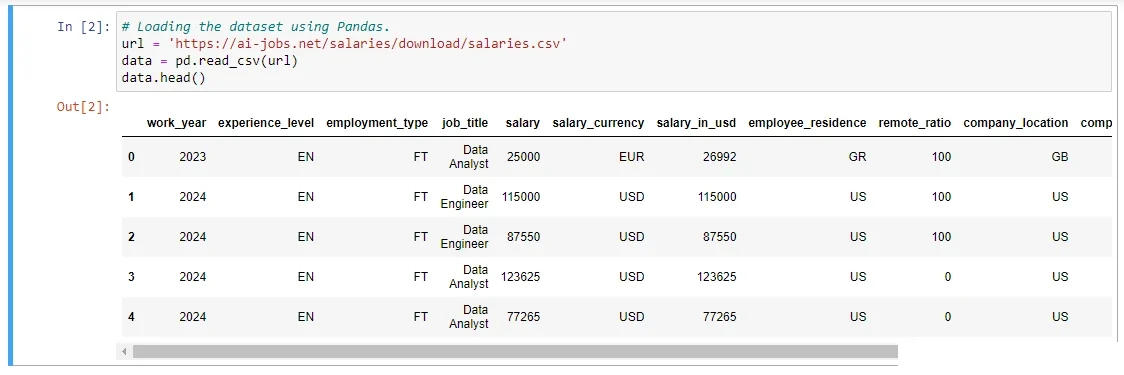
Thus, you can write the same code lines to load and display your dataset in your project.
After loading the dataset as shown above in Figure 3, I used the Pandas library to analyze its:
- Data frame structure,
- Basic statistics,
- Numerical data, and
- Any null values present
to understand its composition before proceeding with the analysis process. The results showed that there were:
a. Some columns with numerical data.
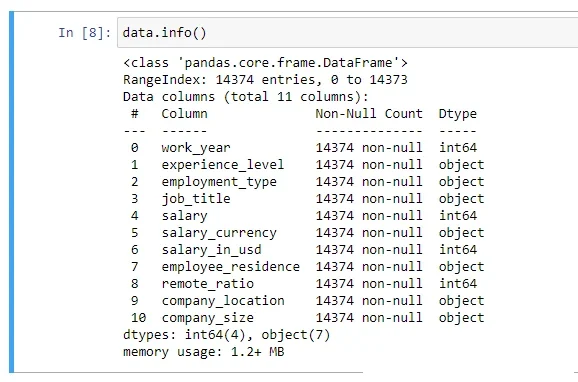
b. Eleven columns in total containing 14,373 entries. Four with numerical data and seven with object data types.
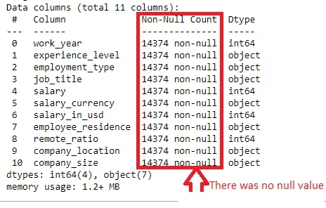
c. There was no null field in the eleven columns.
1.4. Step 1 Conclusions – EDA Process.
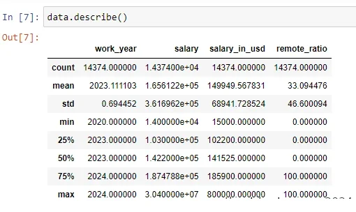
Based on the above inspection results, the dataset has 11 columns containing different entries. The dataset characteristic entries were work_year, experience_level, employment_type, job_title, salary, salary_currency, salary_in_usd, employee_residence, remote_ratio, company_location, company_size. Additionally, there are four (4) columns with numerical data-types as shown in Figure 4.
The results implies that there are seven (7) columns with object datatypes – see Figure 5. The word “int64” under the “Dtype” column indicates that the column contains numerical datatypes. Thus, objects are seven in number. In summary, the dataset has eleven columns—4 with integer datatypes and 7 with object datatypes.
Furthermore, the dataset does not contain any missing values as shown in Figure 6. Finally, the categorical and numerical datatypes are well organized, as shown in the above outputs. Therefore, the data is clean, ready, and organized for use in the analysis phase of the project.
Tip: Write or copy-paste the same code snippets in your project Jupyter Notebook cells and you will get similar results in no time.
Step 2: Data Preprocessing for the End-to-End Data Analysis Phase.
The main preprocessing activities performed were dropping the unnecessary columns, handling the categorical data columns, and feature engineering.
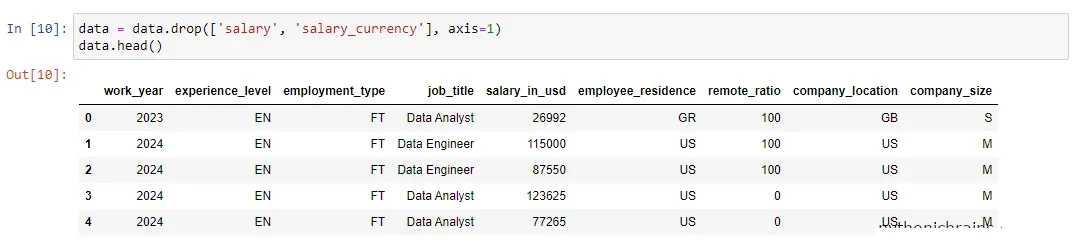
2.1. Dropping the Unnecessary Columns.
The columns dropped were the salary and salary_currency. This is because the salary column had different currencies depending on employee residence and company location, and they were converted into USD from other currencies.
Thus, they were unnecessary because I only needed the salary amount in one currency – US Dollars. The code snippet in cell 10 produced the results displayed in out [10] below it – check Figure 7.
2.2. Handling the Categorical Data Columns.
Do know or have an idea of what we mean by handling categorical datatypes? It is a very simple concept and exercise in data analysis. When we talk about handling the categorical datatypes, we simply mean counting and displaying the columns with object type data.
For example, in this project ‘experience_level’ is categorical or object type because it is presented as text. Thus, you should note that the Panda’s “. describe ()” function directly summarizes numerical data only. As result, to display a summary of categorical datatypes you have to convert them to a ‘category’ type.
2.2.1. How to convert categorical columns into ‘Category’ type
To do this, you use the “. astype(‘category’)” function. For this project, I developed a code snippet summarizing and displaying all the categorical columns in the Salaries Dataset. The first five entries were printed out and indexed from zero, as shown in the sample below.
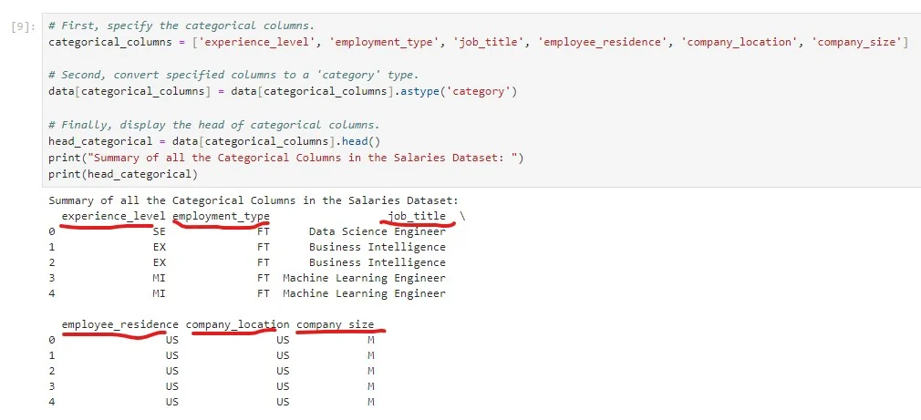
To apply the same concept in your project, you must specify the categorical columns in your dataset and replace them in the code snippet in Figure 8.
2.3. The Engineered Features
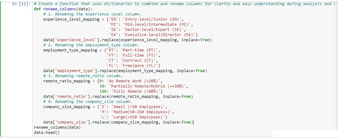
Making the data in the dataset more meaningful and valuable to the project is crucial. Therefore, I engineered two new and crucial features in the dataset. As a result of the engineering process, our new features were full name labeling and salary conversion. Now you have a clue about the engineered features. Next, let us describe how each feature came about and into existence.
2.3.1. Full Name Labeling:
Initially, some of the column titles in the dataset were written in short forms by combining the title initials. For example, FT was the short form name for the full-time column, and so on.
Thus, I took all the titles written in short form, wrote them in their full names, and added the initials at the end of the names. For example, I changed “FT” to Full Time (FT). See the highlighted sections on the screenshot below.
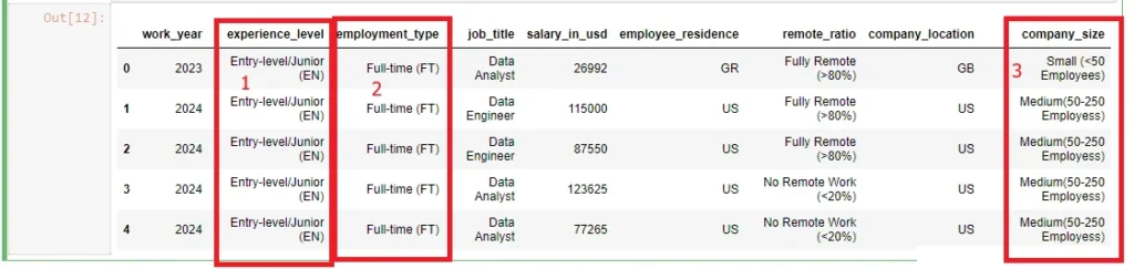
As a result, this ensured proper labeling, understanding, and comprehension, especially during data visualizations. Additionally,
In summary, the Python code snippet below enabled me to engineer the simple feature above. The results were as a result of executing the function in the Jupyter Notebook cell.
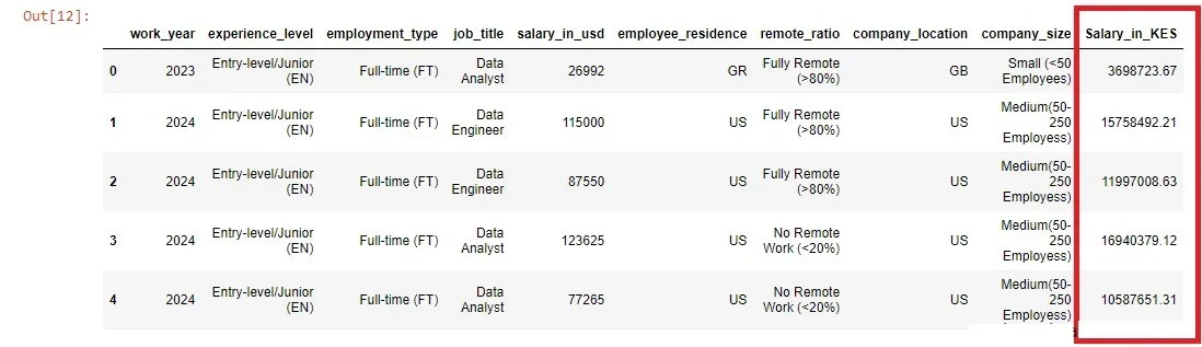
2.3.2. Salary Conversion:
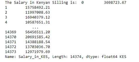
The initial salary column was in USD dollars. Similarly, just like in the previous feature, I came up with a method of changing the “salary_in_usd” column into Kenyan Shillings and renamed it “Salary_in_KES.” Since the dataset is updated weekly, the conversion process was automated. First, a function was created that requests the current USD Dollar exchange rate versus the Kenyan Shilling. The code snippet shows the function.
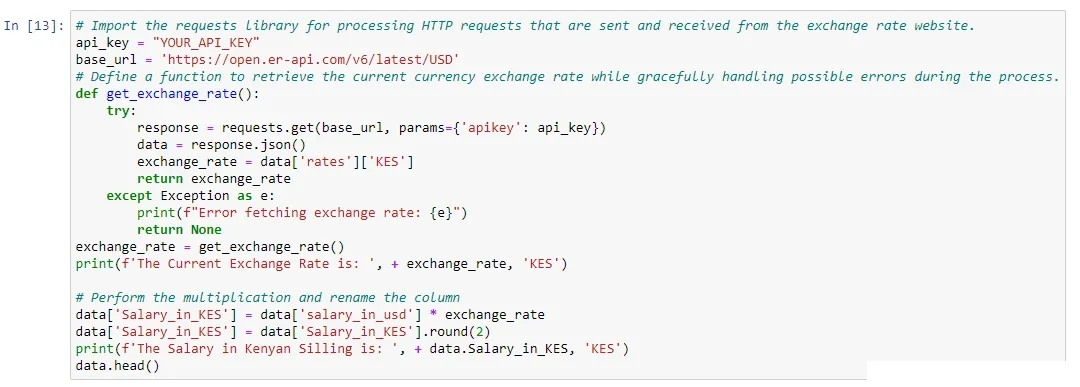
The function uses an API Key and a base URL for a website that requests the current exchange rate, prints it on the output, and multiplies it with salary calculated in USD dollars to create a new column named “Salary_in_KES.”
Therefore, every time the data-jobs guide application is launched, the process will be repeated, and the output will be updated accordingly.
After executing the function for the first time, the initial exchange rate was 156.023619 KES. See Figure 13 for confirmation.
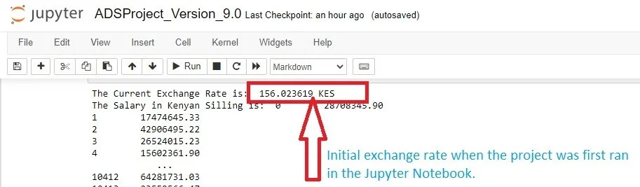
This implies that the function is working as expected. Secondly, the function multiplied the exchange rate value by the salary values in dollars to get the salary value in Kenyan money.
2.3.2.1. Proof the Automated Conversion Process was Effective:
This was proven during the application development as the current value was printed out every time the data analysis Jupyter Notebook was opened and the cell ran.
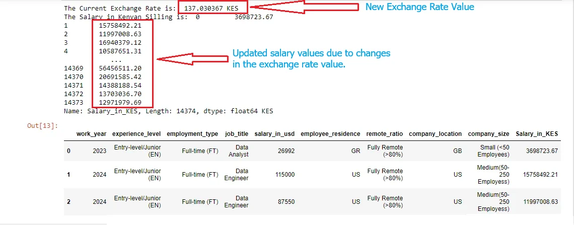
To prove this further, the screenshot above (Figure 13) of the project was first taken in December 2023. Based on it, the current exchange rate then was 156.023619 KES. In March 2024, the feature gives back an exchange rate of 137.030367 KES in Figure 14. Thus, we can conclude that the function captures all the forex exchange rate changes.
Let us find the difference by taking the initial amount minus the current exchange rate. That is 156.023619 – 137.030367 = KES 18.993252. At this moment, the Shilling has appreciated against the US dollar by approximately 19 KES. Finally, it is important to note that the process is constant.
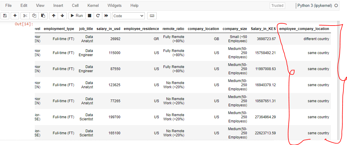
2.3. Employee Company Location Relationship:
I created a new dataset column named “Employee_Company_Location.” The function program created checks and indicates in the new column if an employee comes from the company location. Therefore, this is true if the employee residence and country codes are the same in the dataset. For example, in the screenshot below, the first person resided in a country different from the company location. Based on the first entry, it means that the country code is different from the employee residence code.
Step 3: Visualization of the End-to-End Data Analysis Results
Here, we are at the last step of phase 1. I hope you have already learned something new and are getting inspired to jump-start your end-to-end data analysis project. Let me make it even more interesting, energizing, and motivating in the next graphical visualization stage. In the next section, I’m going to do some amazing work, letting the data speak for itself.
I know you may ask yourself, how? Do not worry because I will take you through step by step. We let the data speak by visualizing it into precise and meaningful statistical visuals. Examples include bar charts, pie charts, and line graphs among others.
3.1. 9 most essential dimensions developed from the dataset contents.
Based on characteristics of our dataset, I developed nine critical dimensions. This means that only two characteristics were not used, thus the results are of high quality. The accompanying screenshot figures show the code snippet used to process the data and visualize each dimension.
Pro Tip Secret for You: To get the interpretation of the visualizations, check out for phase 2 where they are explicitly described.
Let us look at each of the 9 critical dimensions in details. The main aim is to understand what they are and how they came into existance.
3.1.1. Employment Type:
This dimension looks at employee roles in the dataset. Thus, its main agenda is to unravel the significant salary differences based on the employee roles. Based on the project data, the roles present were full-time (FT), part-time (PT), contract (CT), and freelance (FL) roles.
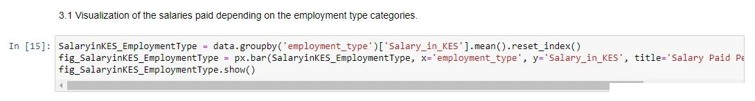
Upon executing the above Python code snippet in the Jupyter Notebooks worksheet, you generate the visualization below. Therefore, in our case, the generated is a bar graph showing total average salary paid per each employment type.
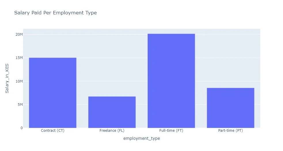
For example, those employed on Contract (CT) were paid 15 Million Shillings cummulatively. Similarly, Freelance (FL) employees earned a cummulative salary of about 5.4 Million.
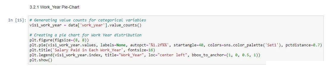
3.1.2. Work Years:
Examining how salaries evolve over the years. For example, the total average salary paid and reported in 2023 is different from the year 2022. Based on the pie chart in Figure 18, 2023 had higher avarage cummulative salary paid (59.27%) compared to 2022 which was 11.49%.
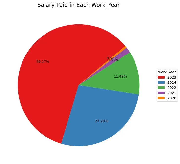
The colored data visualization diagram in Fig. 18 was generated by the code snippet in Fug. 19 below.
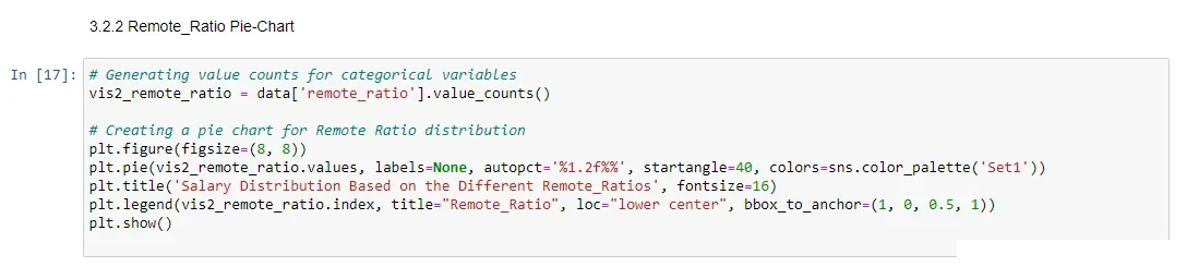
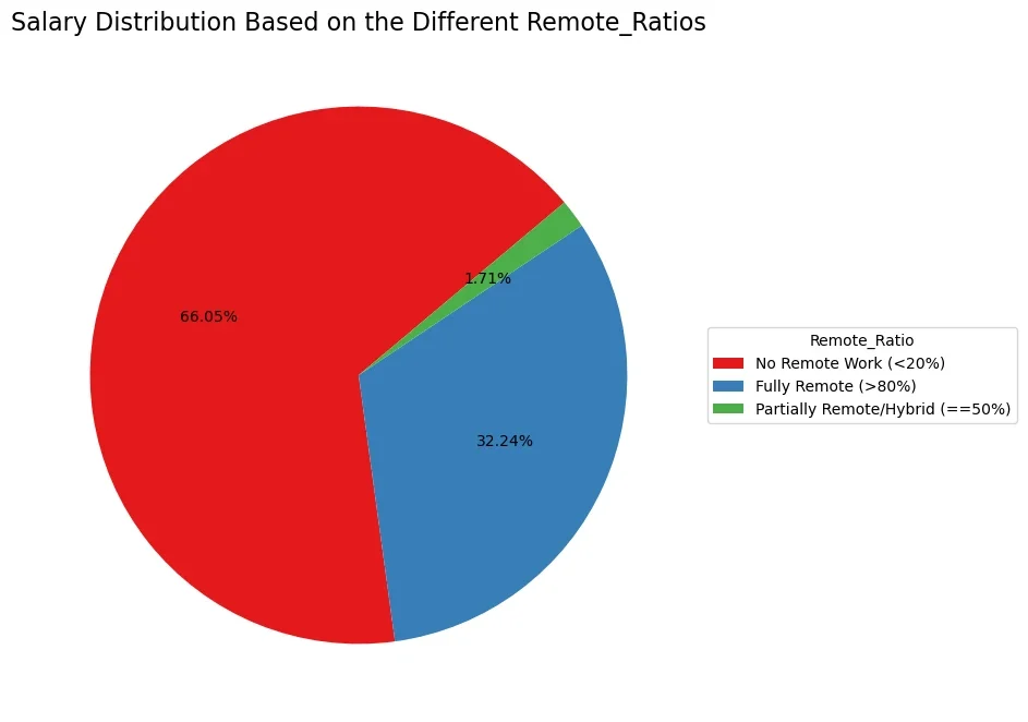
3.1.3. Remote Ratio:
Assessing the influence of remote work arrangements on salaries.
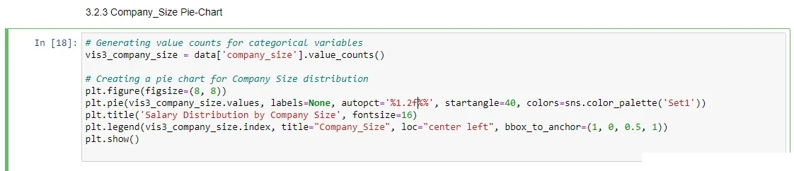
3.1.4. Company Size:
Analyzing the correlation between company size and compensation.

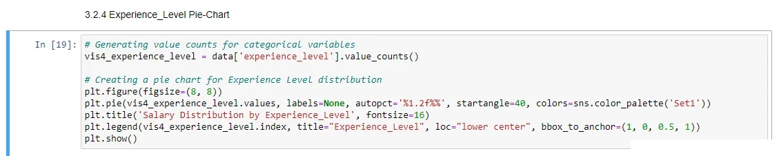
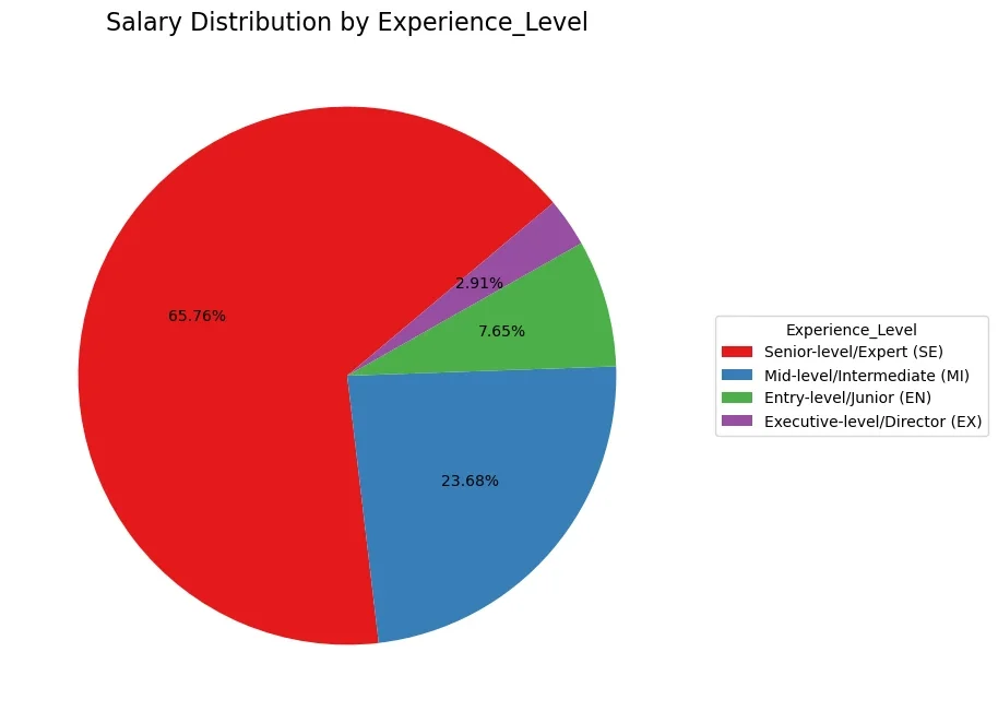
3.1.5. Experience Level:
Understanding the impact of skill proficiency on earning potential.
3.1.6. Company Location:
Investigating geographical variations in salary structures.
3.1.7. Employee Residence:
Exploring the impact of residing in a specific country on earnings.
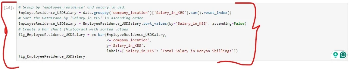
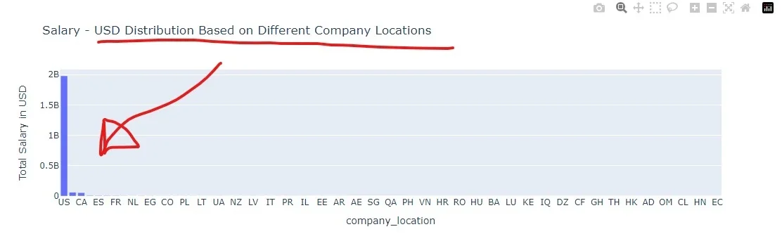
3.1.8. Salary (USD) – Distribution Per Company Location:
Investigating how earnings are distributed based on employee residence and company location.
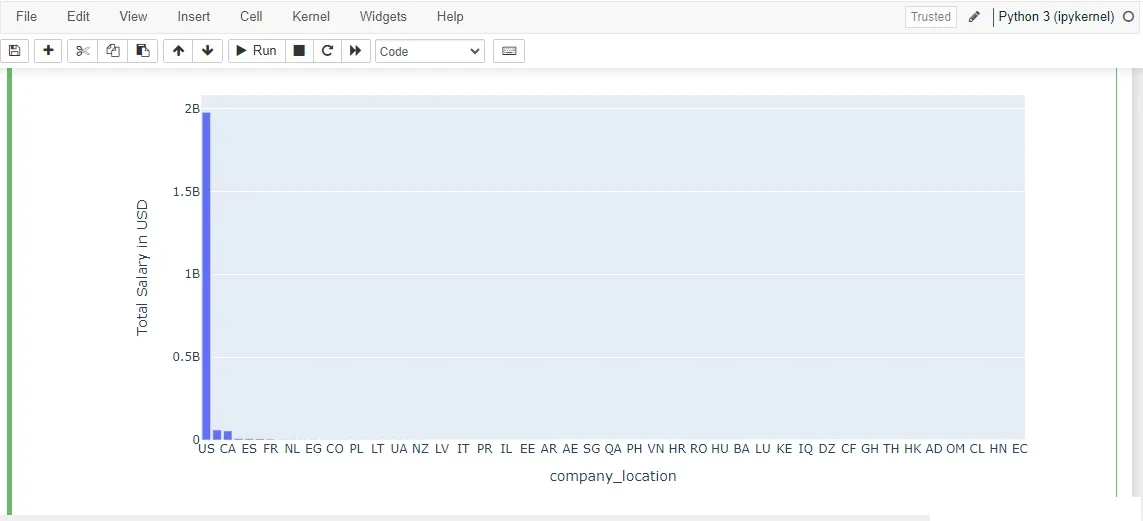
Figure 30: Visualization outcome in barchart.
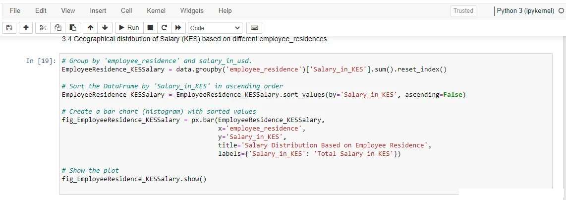
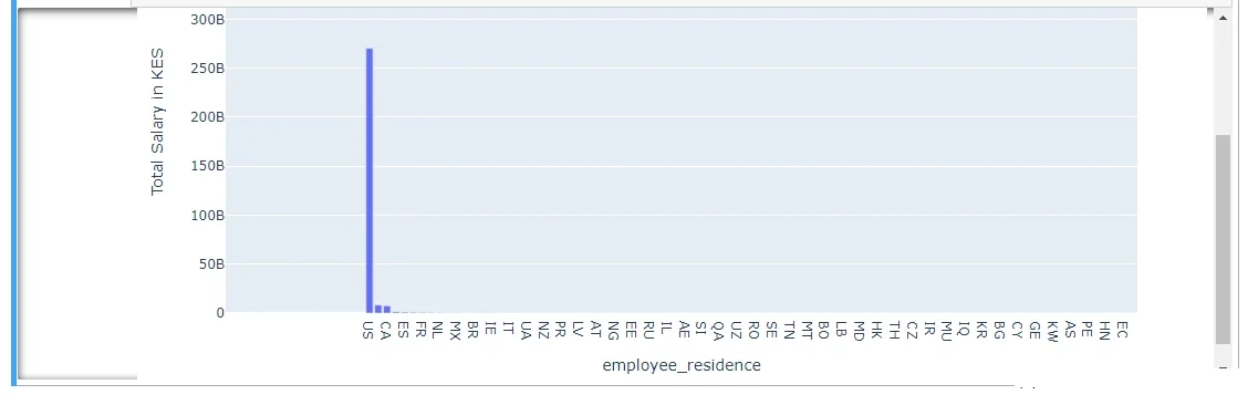
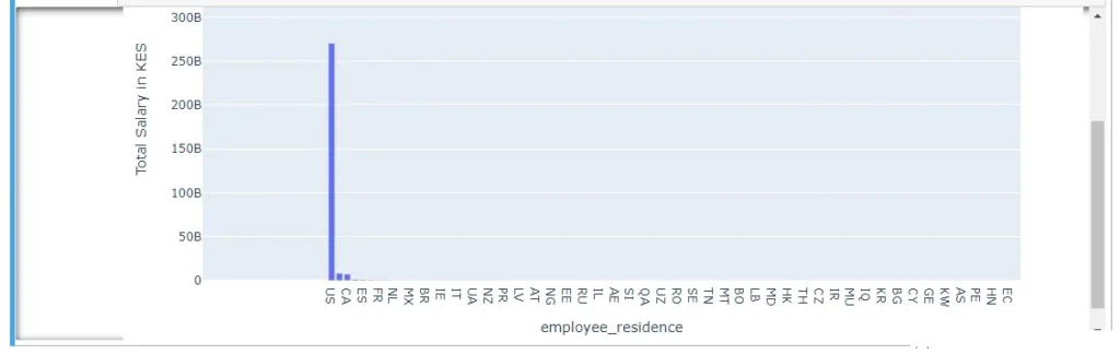
3.1.9. Salary (KES) – Distribution Based on Different Company Locations:
Investigating howearnings in Shillings are distributed based on employee residence and company location.
Project Summary: End-to-End Data Analysis
We have come to the end of phase 1. In other words, the end-to-end data analysis project phase. Generally, you have gained in-depth skills in how you can find, acquire, clean, preprocess, and explore a dataset. Now, you can use our feature engineering examples to enhance your dataset for meaningful study and data-driven results. Secondly, you have learned how to visualize data using the Python programming language and its readily available libraries. Basing your ideas on the code snippets, you can come up with your own project visualizations.
Therefore, considering this project phase alone, you can start and complete an end-to-end data analysis project for your purposes. Whether for your job or class work. Additionally, with the source code snippets, it becomes easy to visualize your data based on them. What I mean is that your dataset may be different, but they directly help you produce similar or better visualizations. In my case and for this project design, the phase opens the door to the second project milestone, phase 2. Building a web-based dashboard or application to showcase my project results and skills.